Let’s face it: skilled nursing leaders don’t need more reports these days. They need less digging. Between call-outs, overtime, and payroll cutoffs, the data HR and payroll admins rely on is often scattered across multiple screens. Rather than a lack of data, they can struggle with finding what they need fast enough to act, whether that means covering a shift or answering questions during a state audit.
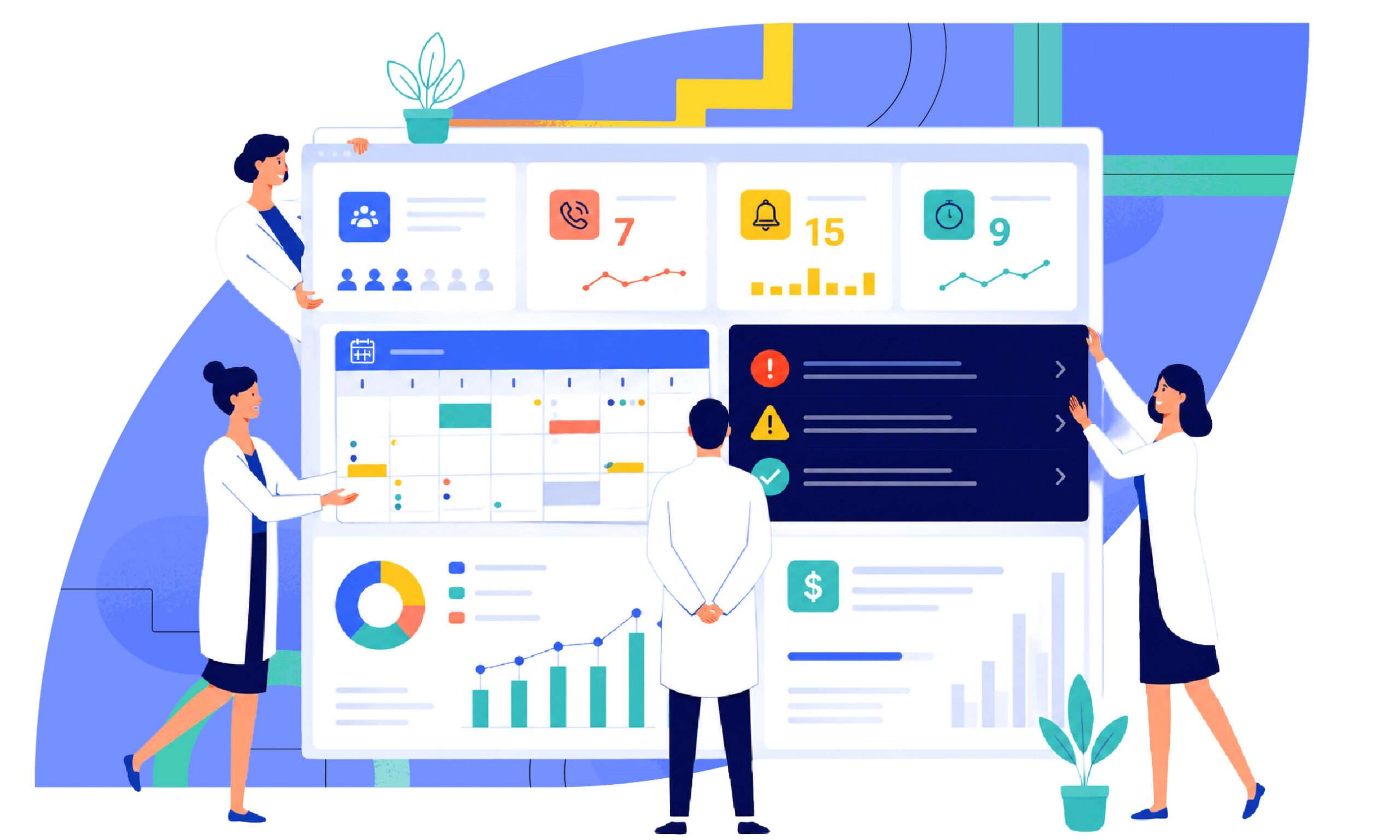
Most healthcare dashboards are built to do one thing well. A scheduling dashboard shows schedulers what they need to ensure their patients are cared for, and facilities are staffed to meet compliance regulations. A payroll analytics dashboard shows payroll admins what they need to validate pay data. A company-wide home dashboard pulls the workforce management highlights from each into one at-a-glance view. Below, we share examples of dashboards that skilled nursing facilities can put to work right now.
Why Healthcare Dashboards Matter More in Skilled Nursing Right Now
First, are dashboards really better than reports? Well, when the pressure is constant, leaders need a real-time view, not a “reporting tool” that surfaces problems without helping anyone act on them.
Staffing remained a top concern for skilled nursing providers in McKnight’s 2026 Outlook Survey. 79% of nurse leaders ranked it among their top four concerns for the year. State-level staffing mandates ranked as the fourth concern overall, cited by 30% of respondents. That kind of sustained pressure is exactly why a real-time view of staffing matters more than a report ever could.
Payroll and Scheduling Data Now Double as Compliance Data
Compliance in skilled nursing isn’t a once-a-quarter event. It’s tested every time a surveyor walks in or when a state audit request lands on someone’s desk.
Yes, the federal staffing mandate is repealed, but state-level staffing mandates are still very much in play across the country. What counts as “compliant” can shift depending on where a facility operates.
That’s exactly one reason why healthcare dashboards matter so much right now. The scheduling and payroll data leaders already rely on can flag staffing gaps, overtime patterns, and payroll variances. It can catch those issues before they become a problem, not after an inspection has already started. Want a deeper look at building a compliance-ready schedule? Check out our guide to mastering SNF scheduling compliance.
CMS Is Also Changing How Payroll Data Gets Submitted
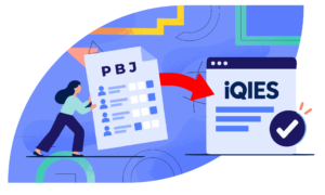
There’s another reason dashboards matter more in 2026. CMS is retiring the legacy QIES system facilities have used for years to submit PBJ staffing data. Starting August 17, 2026, all PBJ submissions move to iQIES instead. Reporting requirements and quarterly deadlines aren’t changing, but the system behind them is.
When changes like the one above happen, facilities with clean, dashboard-verified payroll data will have an easier transition than those scrambling to piece it together at the last minute.
Healthcare Dashboards in Action
The Scheduler View
One of the clearest examples of dashboards in healthcare doing the heavy lifting is a single screen built for schedulers. It shows open shifts, call-outs, attendance alerts, shift requests, overtime, staffing levels, HPPD, live chat, and who’s clocked in, all at once. It’s filterable by date, role, and schedule view.
Instead of running a report to find out the evening shift is short two CNAs, a scheduler sees it the moment they log in. They can post the open shift from the same screen. The filters matter, too. A scheduler juggling multiple units doesn’t need every data point at once, just the ones relevant to what they’re solving for in that moment.
The Payroll View
PBJ is built from payroll and time records. That means an error in payroll can quietly become an error in a federally reported staffing number. It’s the kind of PBJ reporting mistake that trips up nursing homes more often than leaders expect.
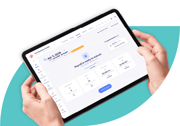
A Payroll Analytics Dashboard is built for a moment like this. It’s available right after payroll verification and before final submission. HR and payroll admins get a dedicated window to review results, spot variances, and validate data. They can access it directly from the payroll summary screen through a “View full comparison” option, before anything goes out the door. That window is the difference between catching a mistake yourself and having to explain it to a surveyor later.
Company Home Dashboard
A company-wide home dashboard gives leaders a high-level, customizable snapshot of payroll and workforce activity. It surfaces time-sensitive alerts and cuts down the number of clicks needed to reach the tasks used most.
You can usually customize the layout, too, meaning an HR leader and an administrator can each set up what matters most to them, in whatever order makes sense. That’s handy in a building where an HR Director and a payroll admin are rarely looking for the same thing on any given day.”
One Screen, Every Number That Matters
Whether it’s a scheduler identifying a last-minute call-out or an HR or payroll admin reviewing attendance data before they submit their PBJ report to CMS, the common thread is the same: the most important data is already on the screen. It’s not buried in a separate report. That’s the value of a dashboard: less time assembling the picture, more time acting on it.
Skilled nursing facilities are already juggling staffing pressure, shifting state mandates, and payroll data that now doubles as compliance evidence. Seeing it all on one screen isn’t a nice-to-have anymore; it’s just what running a building well looks like in 2026. See how this works for yourself by booking a demo with a solutions expert.